The Making Of A Comic
So I thought I’d give you a mini step-by-step of how I do a Catbeard comic as my last behind-the-scenes piece from my vacation. Next week there’s gonna be some special downloadable Catbeard valentines, and then we’re off on more pirate adventure and kitty hilarity!
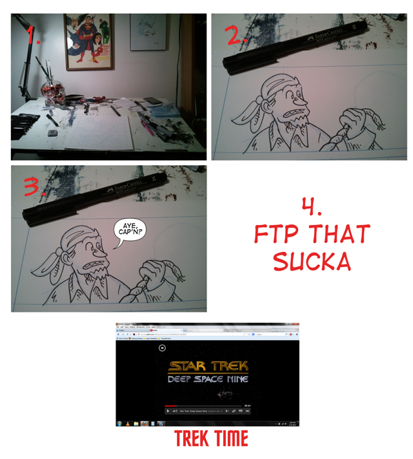
1. So, okay, here’s my drawing table. Here’s where I (sometimes) create Catbeard. Of course, I also sometimes pencil pages at cafes, on my couch, on a friend’s couch, even once or twice at work (but I rarely do it there). I’m afraid I’m not as organized as I should be when it comes to my workspace (unlike my friend Peter Foglesong, whose workspace is immaculately clean) but it does the trick for me. You can see I keep a few pictures above it to inspire me; the JLA one was one my father drew for me when I was five, and the Groo one is a Sergio Aragones original I got back in 2011. Higher up, out of frame, is a Usagi Yojimbo sketch by Stan Sakai. I keep these three where I can look at them constantly to get inspired. The comic is drawn on 9×12 Strathmore smooth surface Bristol 300 series. You may notice that I work in blueline pencil. That’s because it doesn’t reproduce when I scan the picture. Which means I don’t have to erase pencil lines when I get to the next step…
2. Inking! I ink my pages with Faber-Castell Pitt pens and Copic Multiliners. I usually use a Pitt “M” for things in the foreground, a Pitt “F” for things in the immediate background and small details in the foreground characters, and then Copic .1 and .05 Multiliners for any fine background details that might be necessary. I also like to keep a large supply of Pitt brush pens on hand for inking large areas of black (though sometimes if I’m in a hurry I’ll just fill large areas with Photoshop). I use the Pitt pens and Copics because they’re relatively inexpensive and they’re waterproof. I also like to ink with a brush sometimes (you can see my piratey crystal skull brush holder in the first pic) but when I did my first sketch of Catbeard with a brush, it just didn’t feel right to me somehow. The single-weight pens just somehow felt more like what I was after when I did the very first comic. When I’m inking a page of Catbeard, I usually do the foreground characters first, then tighten up the background details that I want in the image. You can tell that the panel behind Gunny is very rough, and I haven’t drawn in all the greebly bits yet, just a quick outline of where things should go.
3. That brings us to the next part, lettering! This comic isn’t finished yet, so I can’t show you a final version of the panel, but I can at least give you a vague idea. I do my lettering on a separate layer from my art. You can use lots of programs to do this, including Inkscape (open source and free of charge), Illustrator, and Manga Studio. I have all three. I also do my border lines on this layer. I know some artists, especially indie artists, like the feel and look of a hand-drawn word balloon and panel border, but I can’t help but think I’ve got this tool to make it really easy to do perfect panels, so why not use it? One thing I try not to do too much anymore, however, is letter my sound effects with a font. There is really something to be said for the unique look a hand-drawn sound effect can bring, in my not-so-humble-opinion. Anyway, once the lettering and panel borders are done, I drop the layer onto the art, flatten the image, and save a hi-res TIFF version and a JPEG version for the web. That brings us to…
4. Really, that’s all there is to it. FTP that sucka. I upload it to my site with the proper naming format for Comicpress and make a post. The rest is automated.
THEN IT’S TREK TIME YEEEAAAAAAAAAAAAAAH
But after that I do it all over again! I’m constantly thinking of ideas, doodling new characters and trying to come up with ways to promote and improve upon Catbeard. Hopefully this has been interesting for you! If you have any questions, let me know in the comments, as I’d love to talk more about the process.
See you all next Wednesday!


